CSS实现垂直居中的几种方式
CSS实现垂直居中的几种方式
第一种、使用绝对定位和负外边距
代码:
1
2
3
4
5
6
7
8
9
10
11
12
13
14
15
16
17
18
19<style type="text/css">
#box {
width: 300px;
height: 300px;
background: #ddd;
position: relative;
}
#child {
width: 150px;
height: 100px;
background: lightblue;
position: absolute;
top: 50%;
margin: -50px 0 0 0;
}
</style>
<div id="box">
<div id="child"></div>
</div>效果:
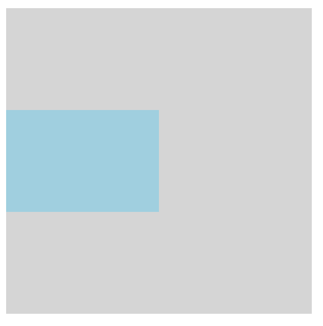
这种方式兼容性很好但是必须提前知道被居中的块级元素的大小,否则没办法精致实现垂直居中。
第二种、使用绝对定位和transform
代码:
1
2
3
4
5
6
7
8
9
10
11
12
13
14
15
16
17
18
19<style type="text/css">
#box {
width: 300px;
height: 300px;
background: #ddd;
position: relative;
}
#child {
width: 150px;
height: 100px;
background: lightblue;
position: absolute;
top: 50%;
transform: translateY(-50%);
}
</style>
<div id="box">
<div id="child">absolute position & transform</div>
</div>效果:
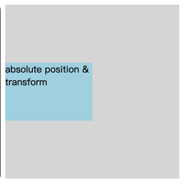
这种方式的话就不需要知道被居中元素的大小了,因为transform中translate偏移的百分比是相对于元素自身的大小。
第三种、绝对定位结合margin:auto
代码
1
2
3
4
5
6
7
8
9
10
11
12
13
14
15
16
17
18
19
20<style type="text/css">
#box {
width: 300px;
height: 300px;
background: #ddd;
position: relative;
}
#child {
width: 150px;
height: 100px;
background: lightblue;
position: absolute;
top: 0;
bottom: 0;
margin: auto;
}
</style>
<div id="box">
<div id="child">absolute position & margin auto</div>
</div>效果
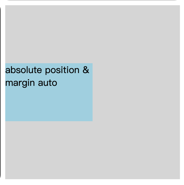
这种方式主要有两个点:第一是被垂直居中元素相对于父级元素要绝对定位,top的值要和bottom的值相等,这里我设置的是0,d当然也可使是其他随意的数,只要相等就可以。第二个点是被居中的元素的margin属性值要设置为auto。这样就可以了。
第四种、使用padding实现子元素垂直居中(或者使用子元素margin)
代码:
1
2
3
4
5
6
7
8
9
10
11
12
13
14
15
16
17<style type="text/css">
#box {
box-sizing: border-box;
width: 300px;
height: 300px;
background: #ddd;
padding: 100px 0;
}
#child {
width: 150px;
height: 100px;
background: lightblue;
}
</style>
<div id="box">
<div id="child">parent padding</div>
</div>效果:
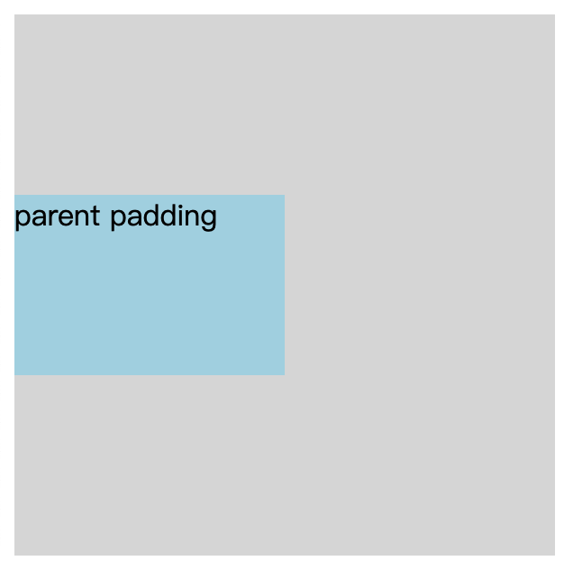
这个没有解释的,就这样。使用margin同理。
第五种、使用flex布局
代码
1
2
3
4
5
6
7
8
9
10
11
12
13
14
15
16
17<style type="text/css">
#box {
width: 300px;
height: 300px;
background: #ddd;
display: flex;
align-items: center;
}
#child {
width: 150px;
height: 100px;
background: lightblue;
}
</style>
<div id="box">
<div id="child">flex</div>
</div>效果
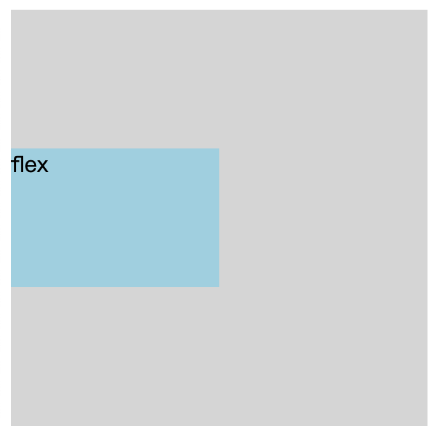
flex布局可以说是我们最常用的布局了,实现起来so easy。附上一篇阮一峰的教程flex布局教程
上面写的代码示例是默认横向布局的垂直居中,当然也可以把排列方向改为纵向然后居中:flex-direction: column;justify-content: center;这样也可以实现垂直居中。
第六种、使用line-height
代码:
1
2
3
4
5
6
7
8
9
10
11
12
13
14
15
16
17<style type="text/css">
#box {
width: 300px;
height: 300px;
background: #ddd;
line-height: 300px;
}
#child {
width: 150px;
height: 100px;
background: lightblue;
display: inline;
}
</style>
<div id="box">
<div id="child">flex</div>
</div>效果:
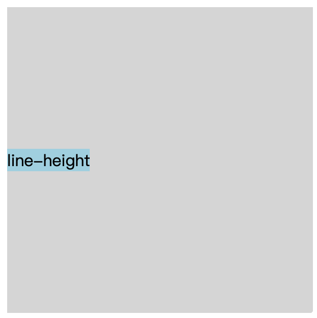
这种方式只适用于当行文本的垂直居中,有很大的弊端。
第七种、使用light-height和vertical-align居中
这种方式只能用于居中图片。看看这个就行了我对CSS vertical-align的一些理解与认识
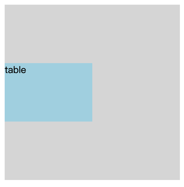
第八种、使用display:table
代码:
1
2
3
4
5
6
7
8
9
10
11
12
13
14
15
16
17
18<style type="text/css">
#box {
width: 300px;
height: 300px;
background: #ddd;
display: table;
}
#child {
width: 150px;
height: 100px;
background: lightblue;
display: table-cell;
vertical-align: middle;
}
</style>
<div id="box">
<div id="child">table</div>
</div>效果:
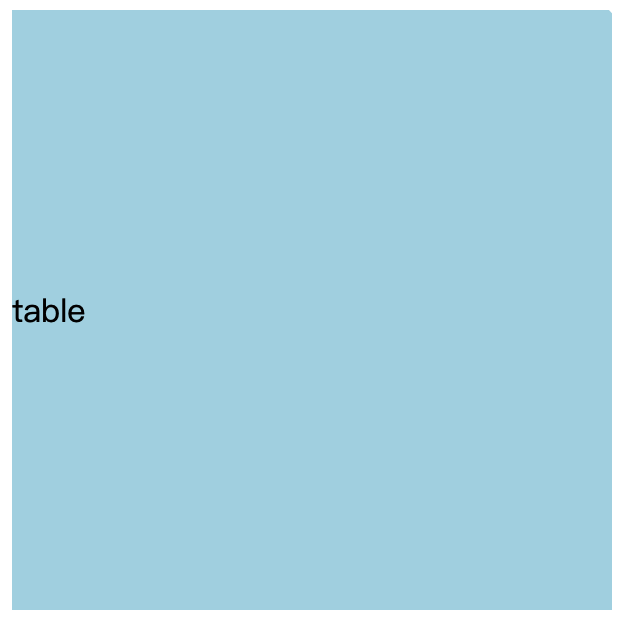
这种方式只能对文字起作用~~
或者直接使用table
1 | |
还有还多种……
比如还有grid布局啊等等…
CSS实现垂直居中的几种方式
https://www.shaohang.xin/2018/03/10/technical/css/css-vertical-center/